Hi, I’m Rance Fan (范耿誌), better known online as Wildsky. I’m a software engineer based in Taiwan, currently working at Taiwan AI Labs.
I enjoy turning ambiguous problems into systems that can keep working. My work spans web applications, product interfaces, backend services, and system integration. Recently, I’ve focused on AI agents, knowledge systems, self-hosted infrastructure, and making software reliable inside real workflows. Past projects include genomic analysis and reporting, knowledge bases and agent builders, and energy analytics platforms.
Outside work, I’ve spent years contributing to open-source communities and building independent projects. I was a volunteer with the Mozilla Taiwan Community, and I’ve built Firefox extensions, public-interest websites, and other web projects. This blog has been my place for writing about technology, work, life, and internet culture since 2014. I also maintain my own homelab and personal knowledge systems.
To learn more about my work, see:
If you’d like to work together, discuss a problem, or simply say hello, email me at [email protected].
Timeline
- Now: Deployed on Cloudflare Pages
- 2026/11/2: Re-sampled the colours from the reference art and switched to the current blue-graphite sea
- 2026/8/16: Rewrote the visual system as “Under Tides”
- 2026/6: Added a live GoToSocial notes feed; the RSS feed now carries full posts
- 2025/9: Added a light/dark theme switch
- 2025/7: Moved to Astro’s built-in i18n
- 2024/4/30: Replaced Next.js with Astro
- 2024/3: Moved from Netlify to Vercel
- 2021/4: Deployed on Netlify
- 2021/3: Rewrote the blog in Next.js and started publishing in both Chinese and English
- 2018/11: Used a tweet share button as the comment section
- 2017/11: Moved from Middleman to Hugo
- 2016/1: Moved from WordPress to a static Middleman site, hosted on surge at blog.wildsky.cc
- 2014/4/26: Set up the blog on WordPress
- 2014/1/8: Started writing
About this blog’s design
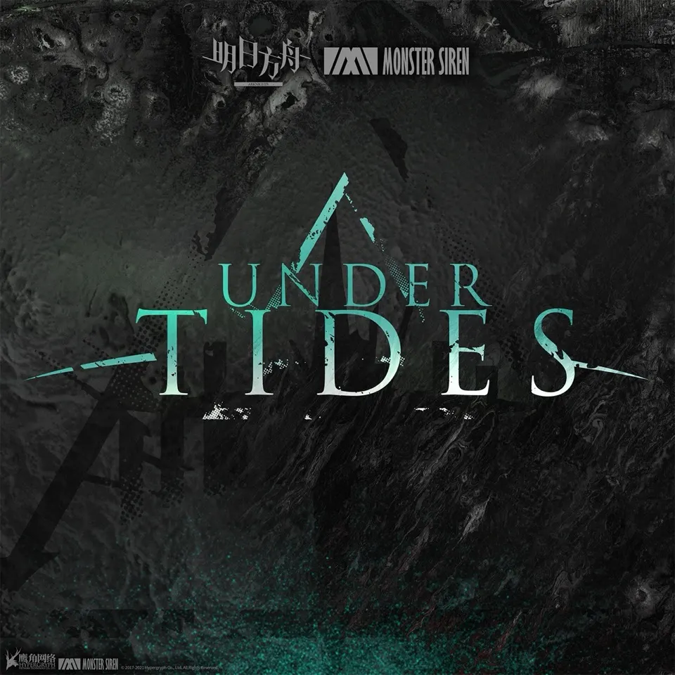
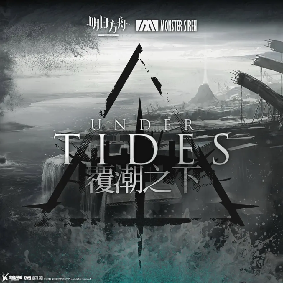
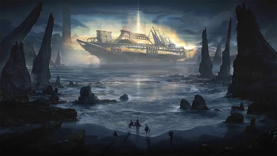
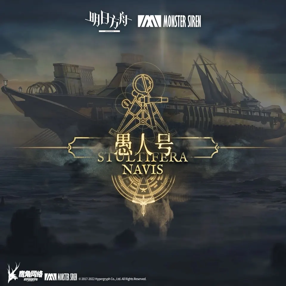
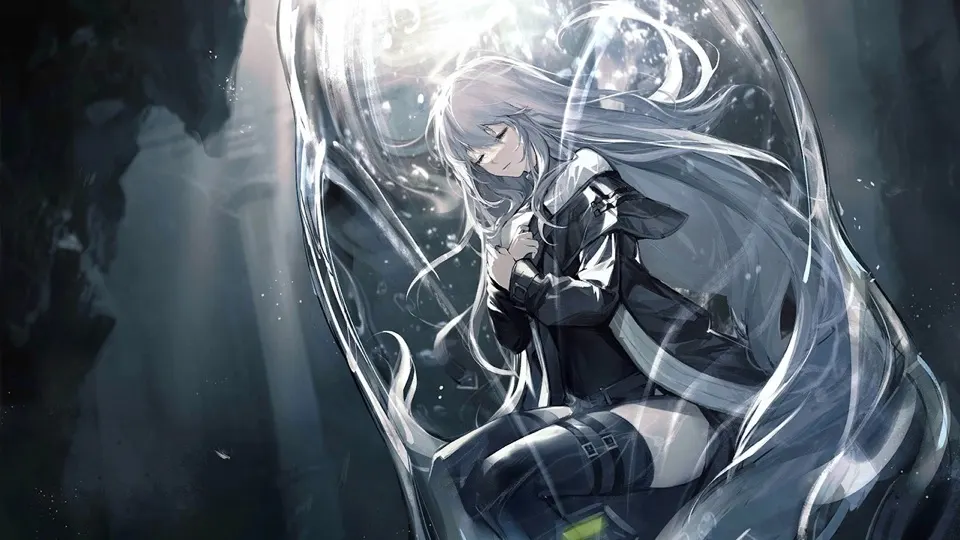
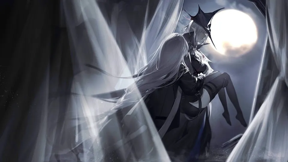
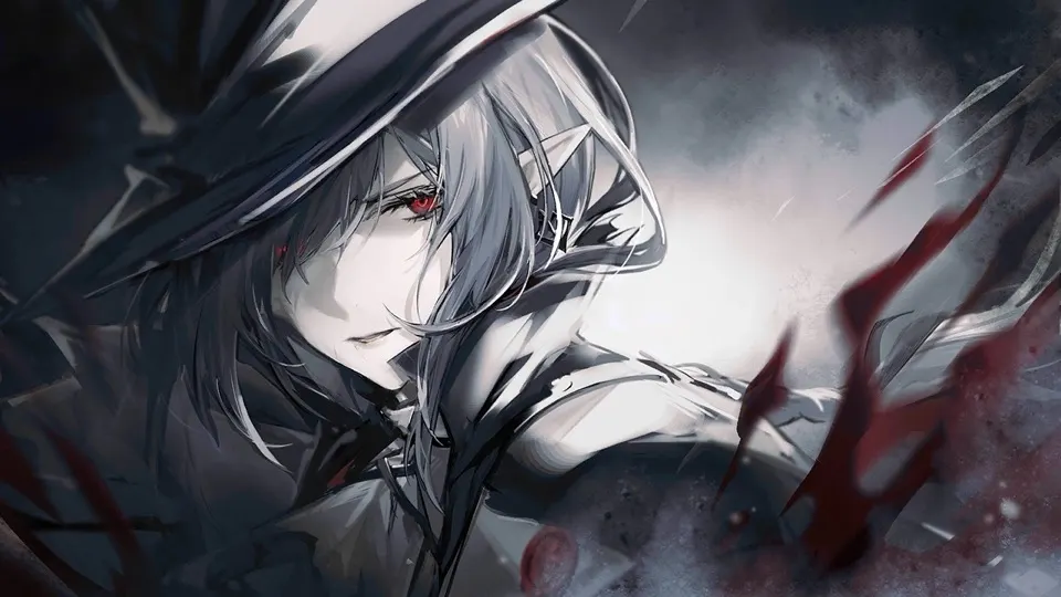
The theme here is the deep sea. Most of the inspiration comes from the Abyssal Hunters art in Arknights, especially the key art and story CGs from the “Under Tides” and “Stultifera Navis” events.
The site’s design doesn’t reuse any official artwork, though. What I did was more like taking it apart: what the colours are, where the light comes from, where the red shows up. Then I slowly translated that into colours and motion for the web.
Colour
I assumed the sea in those pictures was teal. Then I actually sampled the colours with a script (k-means clustering) and found it’s a blue-tinted graphite, only about 20% saturated. The previous version of this blog was way too green, which is probably why it looked a bit tacky XD
The real star of the picture is silver-white. Colour only shows up in small spots:
| Swatch | Hex | Name | Where it’s used |
|---|---|---|---|
#0b0e11 |
Abyss | The deepest part of the page | |
#14191f |
Graphite blue | Main background | |
#28343e |
Light below the surface | The water near the top of the page | |
#e6e8e9 |
Silver | Body text, taken from the hunters’ silver hair | |
#7eb5ac |
Tide teal | Links and reading progress; taken from the Under Tides title lettering | |
#b3262f |
Hunter red | Only the logo, quote rules and “NEW”, echoing the red eyes and blood in the art | |
#d9c89d |
Lamplight gold | Section numerals and text selection; taken from the lights on the Stultifera Navis |
Visual vocabulary
Think of the whole site as a column of water: the further you read, the deeper you sink.
- Near the top, light comes down from the surface, with a bit of dust floating in it.
- The background gets darker as you scroll. The depth gauge on the right of article pages just turns your reading progress into depth (the numbers are made up, obviously).
- There’s hardly anything alive near the surface. The deeper you read, the brighter the glowing specks and jellyfish get. Fish pass by in the distance now and then, and past the halfway point a huge shadow drifts by far away.
- I kept red to a minimum: the logo, quote lines and “NEW”. Same as in the reference art, where red usually only shows up in eyes and blood.
- The W on the home page is drawn with broken strokes, like two spires side by side. The line that draws itself under the tagline is a current.
- Body text is serif, dates and categories are monospace, and the logo and small headings are widely spaced classical capitals. Literature next to engineering, which is pretty much what this blog is about anyway.
Fonts
- Body: EB Garamond, Noto Serif TC
- Logo and small headings: Cinzel
- Dates and metadata: Space Mono
All of them are under the SIL Open Font License.
Sources
- Arknights official website
- Monster Siren Records: the Under Tides soundtrack
- PRTS: 覆潮之下 (Under Tides), 愚人号 (Stultifera Navis)
- Arknights Wiki: Under Tides, Stultifera Navis
Reference images
These are the main pictures I worked from. Clicking one takes you to the matching event page on PRTS:







Arknights and the images above belong to Hypergryph. They’re here only to show where the design came from. If that’s a problem for anyone, please email me and I’ll take them down right away.